Discover lino printing and create your own custom stamps and artwork.
Printmaking has been at the center of human visual culture since the fifteenth century, when Gutenberg's press changed the economics of information. Lino printing (linocut) is a relative latecomer — linoleum was not invented until 1860 — but it found immediate favor with artists because it was cheaper, softer, and more accessible than wood or metal engraving. By the early twentieth century, German Expressionist artists like Ernst Ludwig Kirchner had adopted it as a primary medium, and its ability to produce bold, high-contrast images with strong psychological presence was fully established.
The fundamental principle of lino printing is relief printing: you carve away everything you do NOT want to print, leaving the design as a raised surface that picks up ink. This is the opposite of intaglio printing (etching, engraving) where ink sits in the recessed lines. Relief printing is physically simpler — you press paper onto an inked raised surface — and the tools are far less specialized. The main technical challenge is carving: removing material precisely and safely to create the design you intend.
Designing for lino print requires thinking in positive and negative space simultaneously, which is genuinely different from drawing. In drawing, you add marks to create form. In lino printing, you remove material from a solid block — the marks you make with the carving tool are the areas that will NOT print. This reversal of thinking is the primary skill adjustment for beginners, and it takes several prints before it becomes intuitive. Simple bold designs with clear dark-and-light contrast translate most successfully to lino; complex images with subtle gradation are very difficult to achieve.
Paper selection affects print quality significantly. Smooth papers (Japanese kozo paper, smooth cartridge, newsprint) pick up fine details and produce clean impressions. Textured papers absorb ink unevenly and can fail to pick up fine carved lines. For a beginner's first prints, smooth white cartridge paper in 80–100gsm is widely available and works well. For more professional results, Japanese tissue paper (24gsm) or specialist printmaking papers produce beautiful impressions and are worth the additional cost once you are confident in your technique.
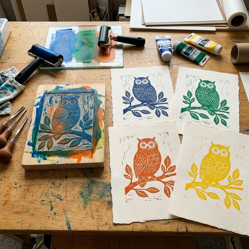
Multi-color lino printing introduces registration — the process of aligning multiple print layers precisely on top of each other. The reduction print method is a creative solution: print the lightest color first, then carve away more from the SAME block, print the next color over the first, then carve again and print the third color. Each new layer is automatically registered because the block never moves relative to the paper. The downside is irreversibility — once you carve for the second color, you cannot make more of the first-color-only print. Edition your first-color prints before continuing.
Editions and signing are part of printmaking tradition that adds both authenticity and collectability to hand-printed work. An edition of ten means you make ten prints from one inking. Number them (1/10, 2/10, etc.) in pencil below the left edge of the image. The title goes in the center, your signature at the right. Signed and numbered editions from a recognizable maker carry the same cultural weight as limited-run objects in any other medium. A well-executed lino print, properly numbered and signed, is a legitimate art object regardless of the maker's experience level.
Materials You'll Need
- Linoleum block (Softcut or traditional)
- Linocut carving tools (V and U gouges)
- Block printing ink (water-based for beginners)
- Brayer (ink roller)
- Glass or plastic sheet for rolling ink
- Printmaking paper or smooth cardstock
- Wooden spoon or baren
Step-by-Step
Design and Transfer
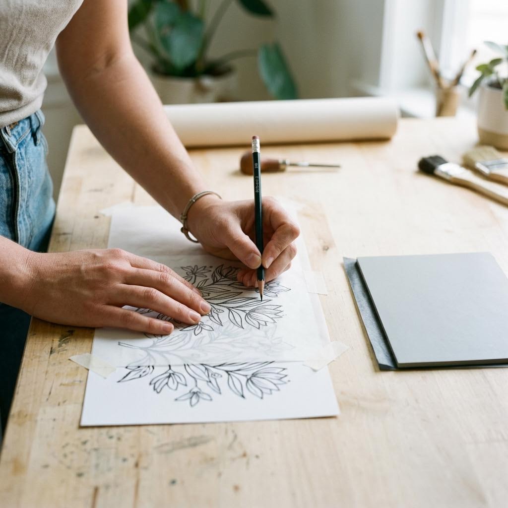
Design your image in reverse. When you print a lino block, the image transfers as a mirror of what you carved — text reads backwards, faces face the other way. Draw or print your design, flip it horizontally, then transfer it to the lino block. The simplest transfer method: shade the back of your design with a soft pencil, place it pencil-side down on the lino, and trace firmly over the lines. The pencil graphite transfers to the lino as a faint mirror image, giving you your carving guide. Keep your design simple for a first print. Lino printing excels at bold, graphic designs with strong contrast between black and white areas. Fine detail — thin lines less than 2mm wide, small dots, delicate crosshatching — is difficult to carve cleanly and often tears out during printing. Sketch the design on paper first, then simplify mercilessly: remove anything that is fussier than it needs to be. The design will look more sophisticated as a print than it does as a line drawing, because the reduction of detail is part of the medium's inherent aesthetic.
Carving the Block
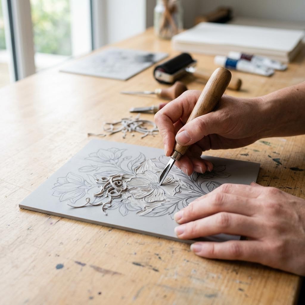
Lino carving tools come with interchangeable heads: V-gouges cut fine lines, U-gouges scoop out larger areas, and broader flat gouges remove background quickly. Start with a V-gouge to outline your design, then use a U-gouge to remove the areas that should print white (background and negative space). The rule is: carved areas print white, uncarved raised surfaces print the color of your ink. Always carve away from your body — this is the single most important safety rule. Keep the block flat on the table and rotate the block rather than your hand when cutting curves. Sharp tools carve cleanly with light pressure; dull tools require heavy force and skid unpredictably. Sharpen frequently on a leather strop. If the lino is hard and brittle (it gets harder in cold weather), warm it briefly on a radiator or with a heat gun — warm lino carves like butter. Softer specialty lino (Speedy-Carve, Easy Cut) is more forgiving for beginners but produces slightly less crisp fine lines than traditional grey lino.
Inking the Block
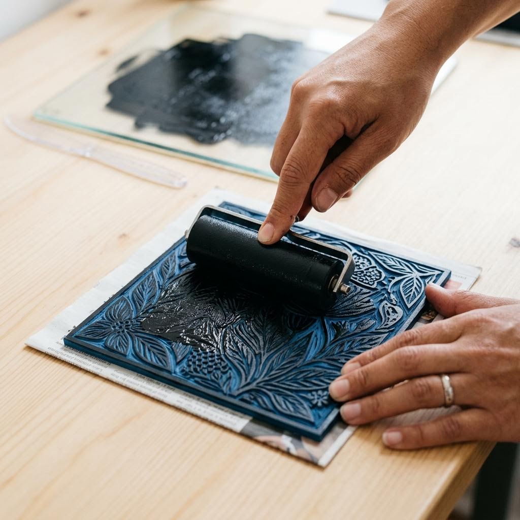
Squeeze a line of ink about 5cm long onto your glass or acrylic inking slab. Use a rubber brayer to roll the ink out until it covers the slab in a thin, even layer — the ink should look like velvet and sound slightly tacky (a gentle snapping sound) as you roll. This is the correct consistency: too wet and it fills carved areas and creates blurry edges; too dry and it produces uneven coverage with gaps. Roll the inked brayer over the lino block surface in two directions (horizontal and vertical passes) to ensure even coverage. The raised surface picks up ink; the carved recesses do not. Examine the block in raking light — if any areas look dry or have gaps, roll once more. Do not over-ink; excess ink pooling in the carved areas ruins the crisp edges that make lino printing distinctive. For multi-color prints, register your second and subsequent colors precisely by creating a registration template: mark the exact position of the paper and block on a backing sheet so you can realign them between colors.
Printing and Revealing
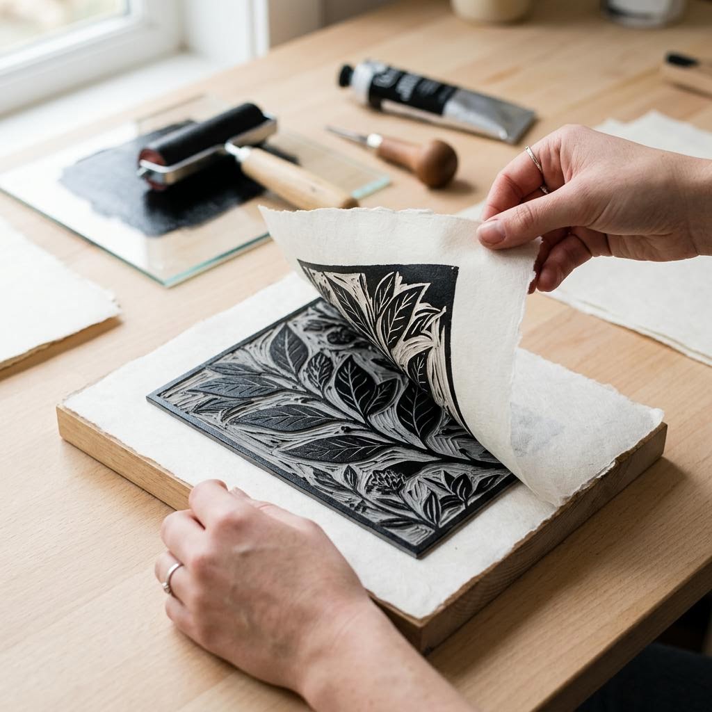
Place your paper onto the inked block (not the block onto the paper) — this gives you better control over placement and prevents smudging. Press firmly and evenly across the entire back of the paper with the heel of your hand, a clean brayer, or the back of a wooden spoon. Work systematically from one side to the other to avoid shifting the paper. Pressure must be firm and consistent — light areas in the print are always caused by insufficient pressure, never by too much. Peel the paper back from one corner slowly — keeping the paper flat, pull it away from the block in one smooth motion rather than lifting it straight up. Straight-up lifting sometimes drags the block up with the paper and smears wet ink. Set the print face-up to dry on a flat surface or hang with clips. Re-ink the block for every print — attempting two prints from one inking always produces a weak second print. Edition your prints in pencil below the image: write the print number over the total edition size (e.g., 3/10), the title, and your signature. This is standard printmaking convention and adds legitimate value to your work.
Written by

Maya Suzuki
Japanese Craft & Washi Art Expert
Maya bridges Japanese craft heritage and contemporary design. She specializes in washi paper art, shibori dyeing, and traditional Japanese textile techniques.