Watercolor Painting for Beginners: Essential Techniques
Master watercolor painting for beginners with these fundamental techniques.
Watercolor has a paradox at its heart: it is simultaneously the most forgiving medium for loose, expressive work and the least forgiving for controlled, precise work. A loose watercolor landscape where colors bleed freely into each other looks intentional and beautiful. The same loose approach applied to a detailed botanical illustration produces muddy chaos. Understanding which mode you are working in — loose and gestural or controlled and precise — and choosing your techniques accordingly is the fundamental skill that separates confident watercolorists from frustrated ones.
Paper quality is not optional — it is the single most important equipment decision a watercolor beginner makes. Student-grade 300gsm (140lb) cold-press cotton paper behaves like a different material from copy paper or cheap mixed-media pads. It absorbs water without buckling, holds multiple wet layers without deteriorating, and allows you to lift and correct mistakes by rewetting dried areas. Cheap paper buckles immediately when wet, which causes paint to pool in the valleys and dry unevenly, and it cannot be rewetted for corrections. Buy one pad of proper watercolor paper rather than three pads of cheap alternatives.
The wet-on-wet technique (painting into a pre-wet surface) and the wet-on-dry technique (painting onto dry paper or dry paint) produce opposite effects and are used for different purposes. Wet-on-wet creates soft, blurry edges and organic blooms — ideal for skies, backgrounds, and atmospheric effects. Wet-on-dry creates crisp, hard edges — ideal for foreground details, defined shapes, and layered glazing. Most paintings combine both: a loose wet-on-wet background with progressively more controlled wet-on-dry details added after each layer dries.
Watercolor pigments vary enormously in their properties. 'Granulating' pigments separate into their component minerals as they dry, creating texture that looks like stone or atmospheric haze — beautiful for landscapes, potentially unwanted in portraits. 'Staining' pigments bond permanently to paper fibers and cannot be lifted once dry — they are intense and permanent. 'Lifting' pigments sit on the paper surface and can be partially removed by rewetting and blotting — useful for corrections and highlights. Learning the behavior of your specific pigments through testing is more useful than memorizing properties from a chart.
Negative painting is a technique that counteracts the instinct to paint shapes directly. Instead of painting a white flower on a dark background, you paint the dark background around the flower and leave the paper white — the flower is defined by what surrounds it, not what fills it. This technique feels counterintuitive but produces results that are impossible to achieve by painting the shape directly, because the background areas can be handled with loose, wet-on-wet washes while the edges of the unpainted shape remain crisp.
Drying time patience is what separates experienced watercolorists from beginners in practice. Going back into a watercolor wash that is 80% dry causes backruns — unwanted hard-edged blooms where wet paint displaces drying paint. These are almost impossible to remove cleanly once dry. The temptation to add more paint, adjust an edge, or add a detail to a partially-dried wash is constant and must be actively resisted. Either work while the area is actively wet (within the first minute) or wait until it is bone dry (often fifteen minutes or more depending on paper and humidity) before touching it again. A heat gun speeds drying significantly and is one of the most useful tools in a watercolorist's kit.
Materials You'll Need
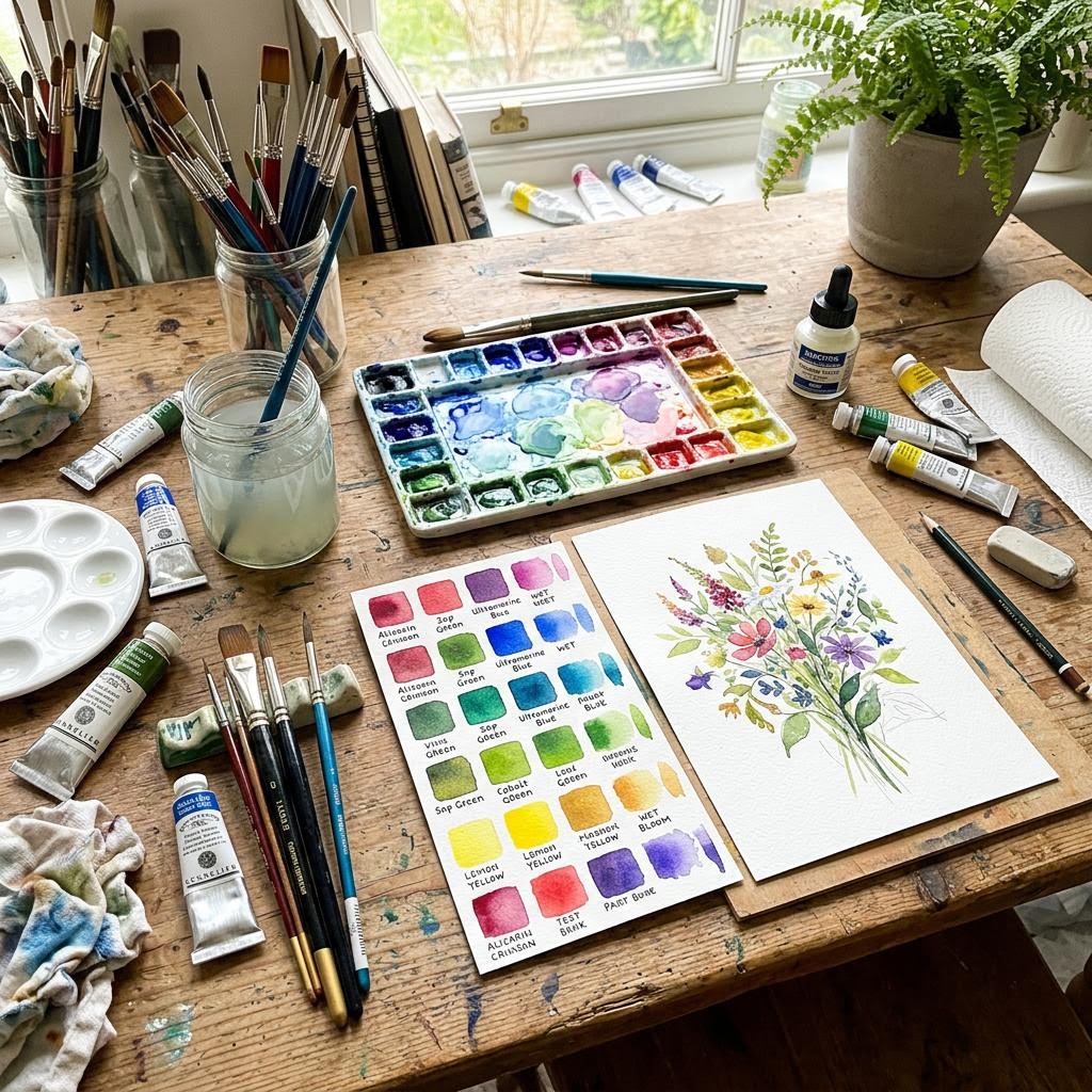
- Watercolor paint set (tubes or pans)
- Watercolor paper (140lb/300gsm cold-pressed)
- Watercolor brushes (Round size 6 and 10)
- Two jars of water
- Paper towels
- Mixing palette
Step-by-Step
Understanding Water Control
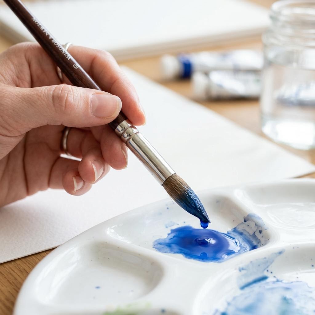
Watercolor is controlled by the ratio of water to pigment on your brush. A brush loaded with mostly water and a little pigment produces a pale, soft wash. A brush with minimal water and dense pigment produces a rich, dark stroke. Between these extremes lies every tone you will ever need. Fill a brush with water, load it with pigment, and touch it to paper — notice how the paint flows and spreads. Too wet and it pools; too dry and it drags. The sweet spot is a brush that is saturated but not dripping, holding paint that flows easily without flooding. Test before painting on good paper. Keep a scrap piece of the same watercolor paper beside your palette and make test strokes — this tells you exactly how the paint will behave before you commit to the real surface. Test your water ratio, test your color mixes, test your edges. Professional watercolorists do this constantly; it is not a sign of hesitation but of precision. Good paper absorbs water differently from cheap paper, so always test on the same paper you will use for the final piece.
The Wet-on-Wet Technique
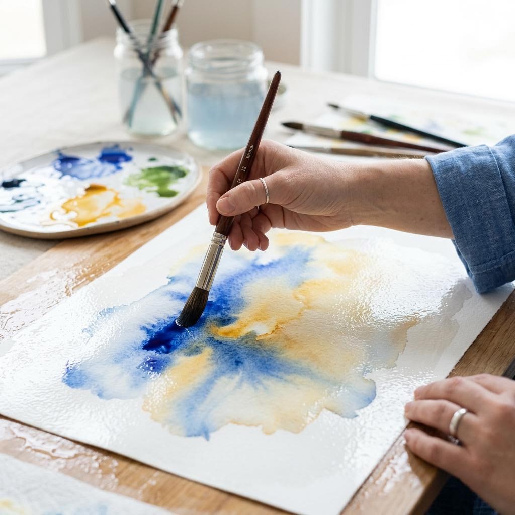
Wet-on-wet means painting onto a surface that is already wet. Pre-wet the paper with clean water using a wide flat brush — cover the entire area you plan to paint with an even layer of water, and wait about thirty seconds until the surface sheen dulls slightly from mirror-bright to a soft glow. This is the ideal wet-on-wet window: wet enough for paint to flow and blend, not so wet that paint simply dilutes away. Drop pigment into the wet surface and watch it bloom and spread on its own — this is the defining quality of wet-on-wet, and it cannot be fully controlled. You can tilt the paper to direct the flow, drop in additional colors while the surface is still wet to create organic blends, or use the tip of a dry brush to gently pull paint in a direction. Resist the urge to over-manipulate. The most common wet-on-wet mistake is going back into the surface while it is 80% dry — this causes blooms called backruns (or cauliflowers), where a wet brush pushes dried paint into unwanted rings. Once an area is drying, leave it completely alone.
The Wet-on-Dry Technique
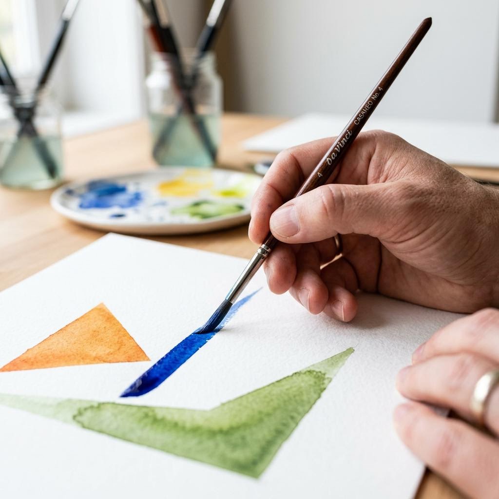
Wet-on-dry means painting with a loaded brush onto completely dry paper, or onto completely dried previous layers. The result is crisp, hard edges — exactly the opposite of wet-on-wet's soft blooms. Use wet-on-dry wherever you need defined shapes: leaf outlines, architectural details, foreground elements that need to stand in front of softer background washes. The contrast between a hard-edged wet-on-dry stroke and a soft wet-on-wet background creates natural depth. The key variable in wet-on-dry is the amount of water in your brush. A fully loaded brush creates a puddle that dries with a hard edge but may leave a tide mark along the edge of the stroke. A well-loaded but controlled brush creates a clean edge. Practice a flat wash on dry paper — load the brush evenly, tilt the paper slightly (5–10 degrees), and drag the brush across in one continuous stroke. Let the previous stroke's lower edge of paint bead slightly, then pick it up with the next stroke. This creates smooth, even flat washes with no visible strokes.
Layering and Glazing
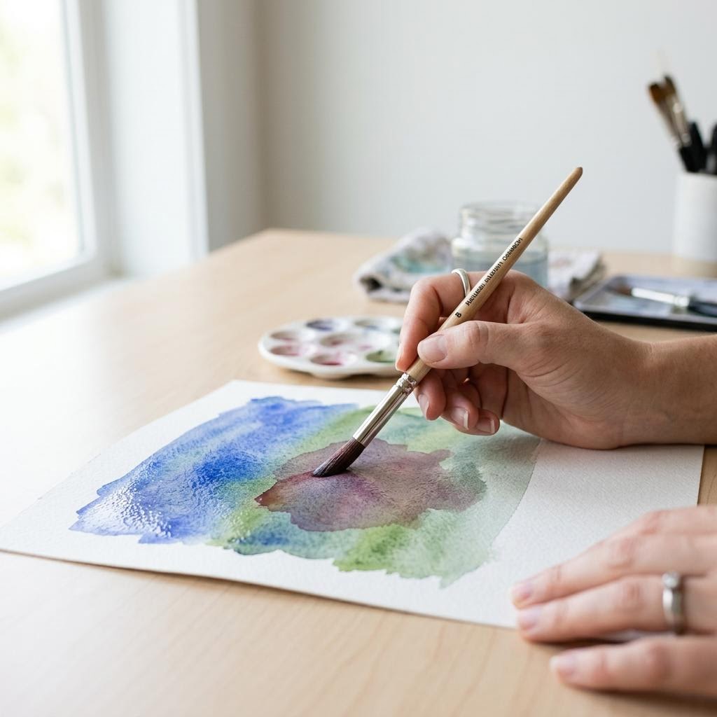
Glazing is the process of adding transparent washes over dried layers to deepen color and create luminosity. Because watercolor is transparent, each layer allows the underlying layers to show through — the final color you see is the optical mix of all the layers stacked. This is fundamentally different from opaque media where layers hide what's beneath. A yellow glaze over a dry blue creates a green without physically mixing the pigments. The depth of color you can achieve through layering is impossible to get in a single application. Let each layer dry COMPLETELY before adding another — even slightly damp layers will lift when a new wet brush touches them, disturbing the layer beneath. A heat gun speeds this up significantly. Always test the glaze color on a scrap piece first; mixing errors are easy on a palette and impossible to fix on paper. Keep glazing layers dilute and transparent; thick opaque layers defeat the purpose of glazing. Three to five thin layers will produce richer, more luminous results than two heavy ones. Shadows are excellent candidates for glazing: a light value purple or blue glaze over a dried form creates shadow depth without muddying the underlying colors.
Written by

Clara Jensen
Scandinavian Home Craft & Candle Maker
Clara brings Nordic simplicity and warmth to home crafting. She specializes in soy candles, beeswax wraps, and hygge-inspired home accessories.